CSS Container Queries - The future of responsive web design is almost here
With the huge number of smartphone users and increasing power of these devices, ensuring that your web applications run fine on all screen sizes is more important than ever. Fortunately CSS provides a couple of ways to style the same HTML in different ways on different devices.
Responsive web design right now
You can skip to the next section if you're already familiar with
@mediaqueries.
We can use @media queries in our CSS to conditionally apply CSS styles on the basis of the device or browser/user-agent properties. These properties could be the width of the screen, orientation of the device, whether the device is a screen reader or a printer, etc.
Here is a small demo showing how media queries work.
We will just add one div in our html.
<div class="box">
    This is a responsive box. Resize your browser width to see the styles change
<div>
And here is our CSS:
.box {
  background: lightblue;
  width:100%;
  height:100vh;
}

@media(max-width:800px) {
  .box {
    background: hotpink;
    color: white;
    font-weight: 700;
  }
}
You can check the whole demo here: https://codepen.io/rajatkapoor/full/NWpgWor
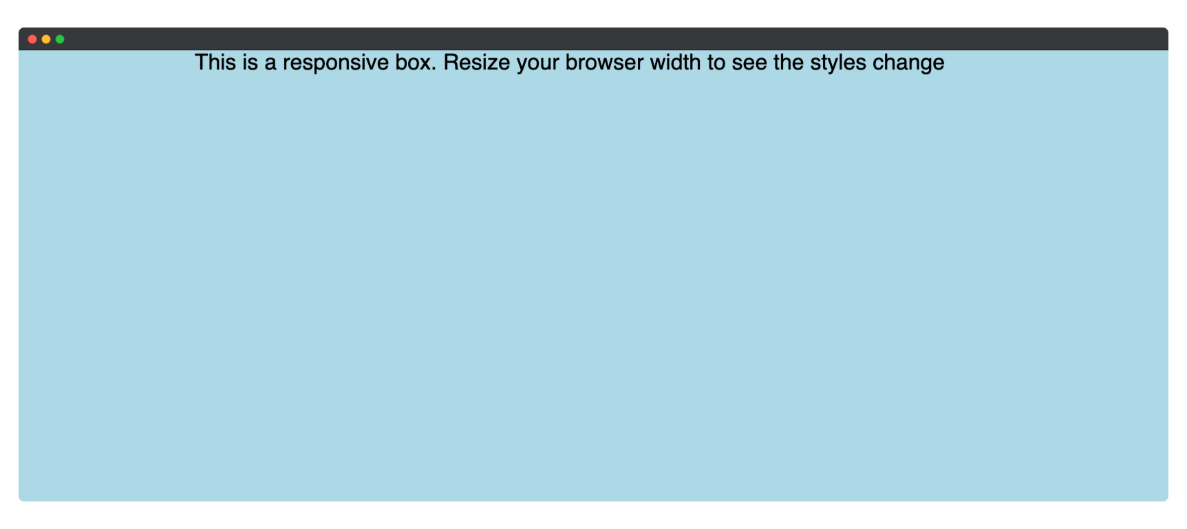
If you open the above link on a desktop/laptop you will see a screen with a blue background with black colored text written on it. Something like this:
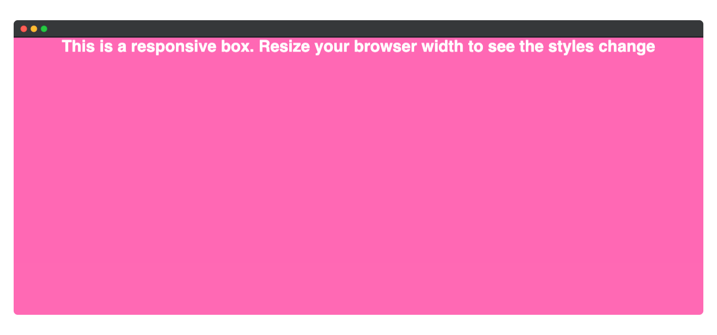
But if you open this on a smartphone, you will have a pink background instead of blue and the text would be written in white.
Magic right?
This is possible because of the @media queries. This happens because we apply certain styles only when the width of our device screen is less than 800px. This is the CSS that causes the different styles on mobile and desktop.
@media(max-width:800px) {
  .box {
    background: hotpink;
    color: white;
    font-weight: 700;
  }
}
Enter @container queries
@container queries are only supported on Chrome Canary with the
enable-container-queriesflag enabled. You can download Chrome Canary here. Once installed, open the URL chrome://flags/#enable-container-queries and enable container queries.
There is a polyfill under development that you can use to use container queries today. You can check it out here.
@container queries are one of the many features that are coming to CSS. Unlike media queries, which can only let you conditionally apply CSS styles on the basis of the browser properties(width, orientation, etc), container queries allow you to conditionally apply styles based on the properties of the container!
For example, using container queries you can style cards to appear differently depending on the size of the element they are placed in. And that is what we will try to build.
Here's what what we will build
We will build a card that will change styles depending on the width of its container, and not the width of the screen.
Here's a demo that works only on Chrome canary.
Here's the same demo with the cqfill polyfill.
You can see the full code of this demo in this github repository.
Let's try it out
We'll use good old plain HTML and CSS for this project. Here is our initial HTML. Notice that we have also linked to our own "styles.css file".
<!-- index.html -->
<!DOCTYPE html>
<html lang="en">

<head>
    <meta charset="UTF-8">
    <meta http-equiv="X-UA-Compatible" content="IE=edge">
    <meta name="viewport" content="width=device-width, initial-scale=1.0">
    <title>Container Queries | Rajat Kapoor</title>
    <!-- our own styles -->
    <link href="./styles.css" rel="stylesheet">
</head>

<body>
</body>

</html>
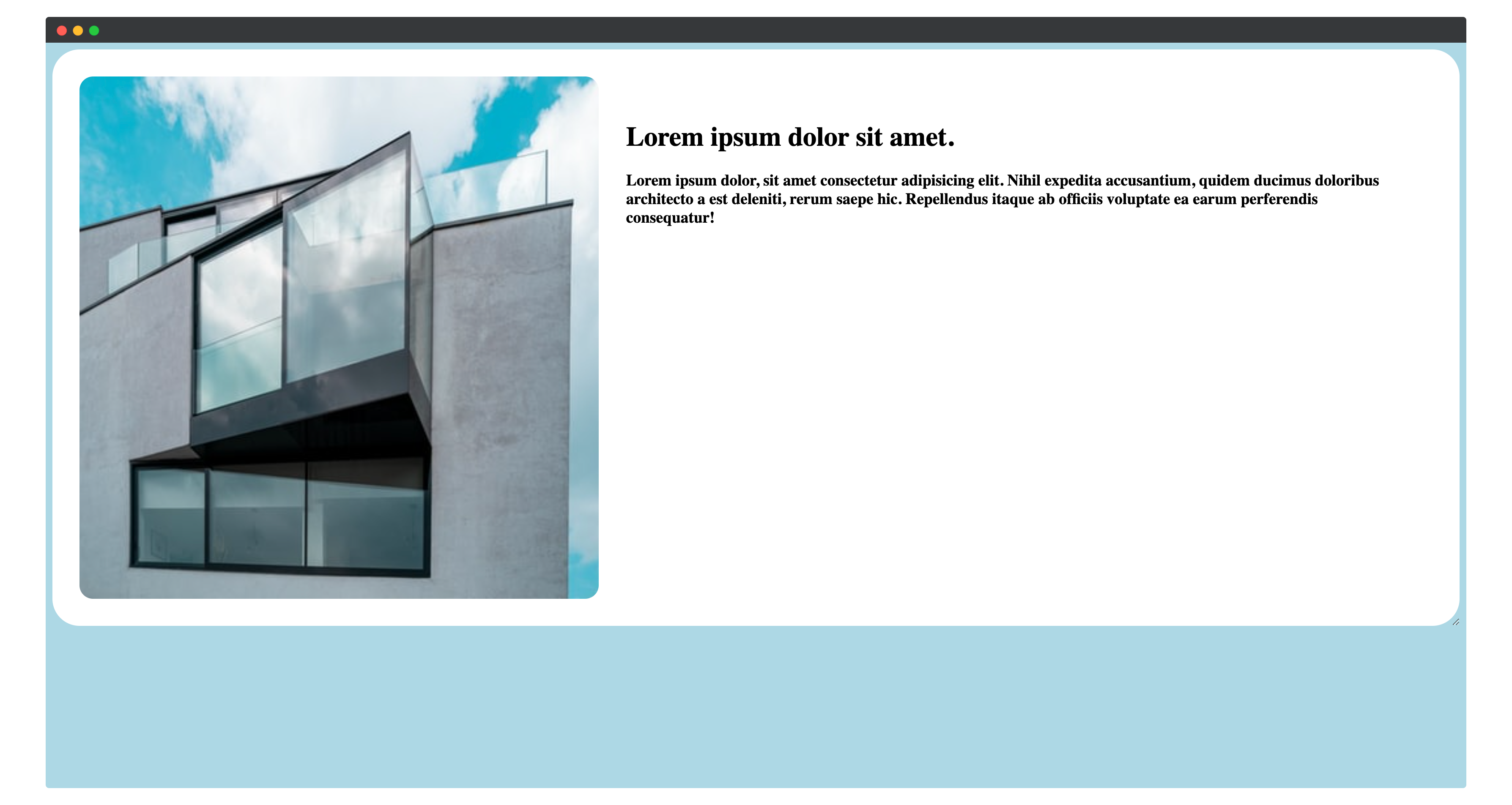
We will start by creating a very simple card, with an image, title, and some text. This card will have a card--header with an image and a card--body with a title and other card content. The card is styled using flex with flex-direction: row, so the image stays on the left-hand side and the rest of the text content on the right.
We will wrap this card in a div with class parent large and will wrap all of this in a container to center everything on the page.
<!-- index.html  -->
<!-- ... -->

<body>
    <div class="container">
        <div class="parent large">
            <div class="card ">
                <div class="card--header ">
                    <img class="card--image" src="./img.jpeg" alt="card image">
                    <!-- we have this img.jpeg file in our folder -->
                </div>
                <div class="card--body ">
                    <h1 class="card--title ">
                        Lorem ipsum dolor sit amet.
                    </h1>
                    <h3 class="card--content ">
                        Lorem ipsum dolor, sit amet consectetur adipisicing elit. Nihil expedita accusantium, quidem
                        ducimus doloribus architecto a est deleniti, rerum saepe hic. Repellendus itaque ab officiis
                        voluptate ea earum perferendis consequatur!
                    </h3>
                </div>
            </div>
        </div>
    </div>

</body>
/* styles.css */
body {
    background-color: lightblue;
}

.container {
    display: grid;
    place-items: center;
    grid-gap: 1em;
}

.card {
    background: white;
    border-radius: 2em;
    display: flex;
    flex-direction: row;
    overflow: hidden;
    padding: 2em;
}

.card--header {
    width: 100%;
}

.card--image {
    border-radius: 1em;
    object-fit: cover;
    height: 100%;
    width: 100%;
}

.card--body {
    padding: 2em;
    flex: 3
}

.card--header {
    flex: 2
}

.large {
    width: 100%;
}
This is how your page will look:
 We will now add another
 div with class parent small and copy-paste the same card into it. We will also define styles for the small class.
<!-- index.html -->

<body>
    <div class="container">
        <div class="parent large">
            <div class="card">
               <!-- ...card -->
            </div>
        </div>
        <div class="parent small">
            <div class="card">
               <!-- ...card -->
            </div>
        </div>
    </div>

</body>
// styles.css

.small {
    width: 500px;
}
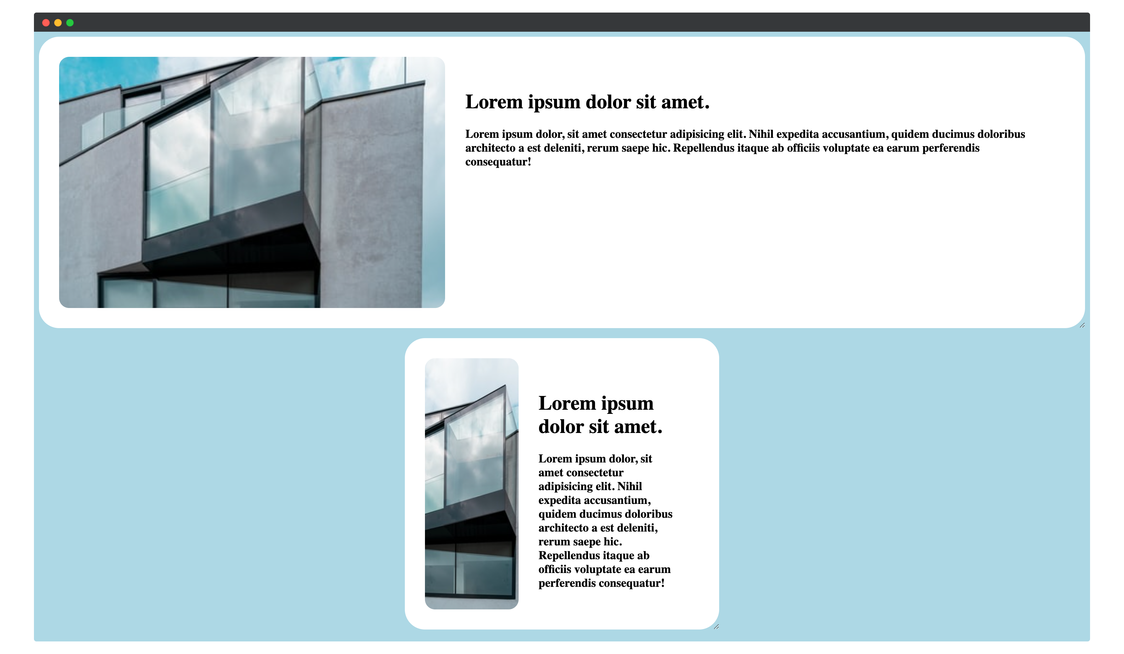
Note that both the cards are exactly the same and are just lying in two different divs. And this is how they look:
Adding container queries
We want the card to have the text content below the image in case the width of the container is less than 500px. We will also change the background of our card to hotpink and make the text white to make the changes more noticable.
For container queries to work, we need to add CSS to the container to define the "containment context" — the container queries of the children inside this containment context react to the properties of this container. We will make the divs with class parent as the containment context of these cards. To do that, we will modify the CSS of the parent class.
/* styles.css */

.parent {
    contain: layout inline-size style;
}
Now we can add container queries to our card.
/* styles.css */

@container(max-width: 500px) {
    .card {
        flex-direction: column;
        background-color: pink;
    }
}
Thats it! Now if you go back to your browser, you will see that the card in the div with the class small has the new styles applied.
Yay 🎉
We were able to control the styling on the basis of the container size and not just the device properties (screen size). That is the power of container queries.
Bonus — Let's make the parent resizable
Do you know you can quickly make anything resizable by just adding CSS. We'll do it to our parentclass.
/* styles.css */

.parent {
    contain: layout inline-size style;
    resize: horizontal;
    overflow: auto;
}
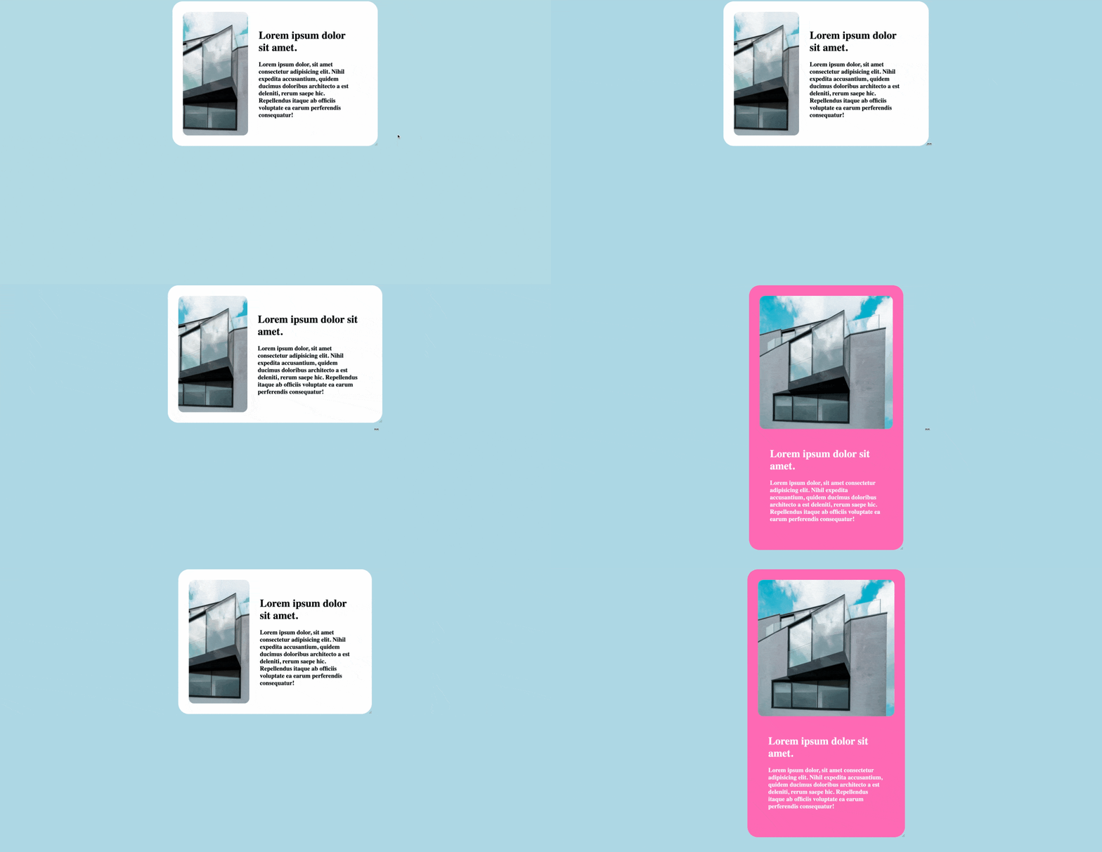
Now both the parent divs can be resized horizontally to see our container queries working in action.
Conclusion
With container queries, we will be able to approach responsive designs in a much smarter way. That said, container queries are in early stages of development. It is not recommended to use these in production right now. In fact, CSSWG changed the syntax between the time I started to write this article to the time I finished writing it 😅.
Follow me on twitter to get more web development related content.
Special thanks to Ahmad Shadeed for helping me with debugging why my
containerqueries were not working in Chrome Canary. You can also read more about container queries in this article
